
Tackling the Technical for an Environmental Watchdog


The Environmental Integrity Project's Oil and Gas Watch site carried a dense dataset built for both technical experts and everyday citizens, but its existing infrastructure caused failed data imports, and the interface buried information in unwieldy tables without the context or navigation that either audience needed to use it effectively.
We led an in-depth discovery phase, running stakeholder interviews and workshops to map the data, its users, and where the current experience fell short, then rebuilt the site with a Vue.js frontend and Xata as the data backend. We reoriented navigation around content types, replaced complex tables with map-reinforced chunks, introduced robust filtering, and designed a minimal, vivid color palette that met WCAG compliance while making key metrics scannable at a glance.
Oil and Gas Watch went from a data-dense, hard-to-navigate resource to a site that serves both policy researchers and general-public users on their own terms, with faster and more reliable data infrastructure, intuitive navigation, and a design that makes environmental accountability data actually usable.
A Site for Every Kind of User
With the sheer density of the data on EIP’s site, it was critical for us to begin the project with a comprehensive discovery phase. We began by conducting in-depth interviews and workshops with their stakeholders to understand not only the data itself, but also how it was collected, who its users are, and where the current data visualization process was not meeting expectations.
These exercises gave us insight into a unique challenge of Oil and Gas Watch: the site was regularly accessed by users with a wide range of technical expertise. They needed a partner who could help them develop a data management and UX strategy that met the needs of all its users in a more streamlined, digestible way.
Simplifying a Data-Dense Interface
With the details gathered during the Discovery phase, we knew we could deliver what EIP needed to upgrade Oil and Gas Watch. Getting there meant wrapping our heads around the data from the technical perspective. At this stage, the site suffered from irregularly formatted tables, unexpected scrolling behavior, and an excess of jargon without proper context. Leveraging EIP’s expertise, we identified the information that technical users needed so we could strategize how it fit into our build. Conversely, we were able to advocate for the layperson user and how they might interpret the information as presented.
Armed with that context, we employed our UX expertise and crafted a strategy that did three fundamental things:
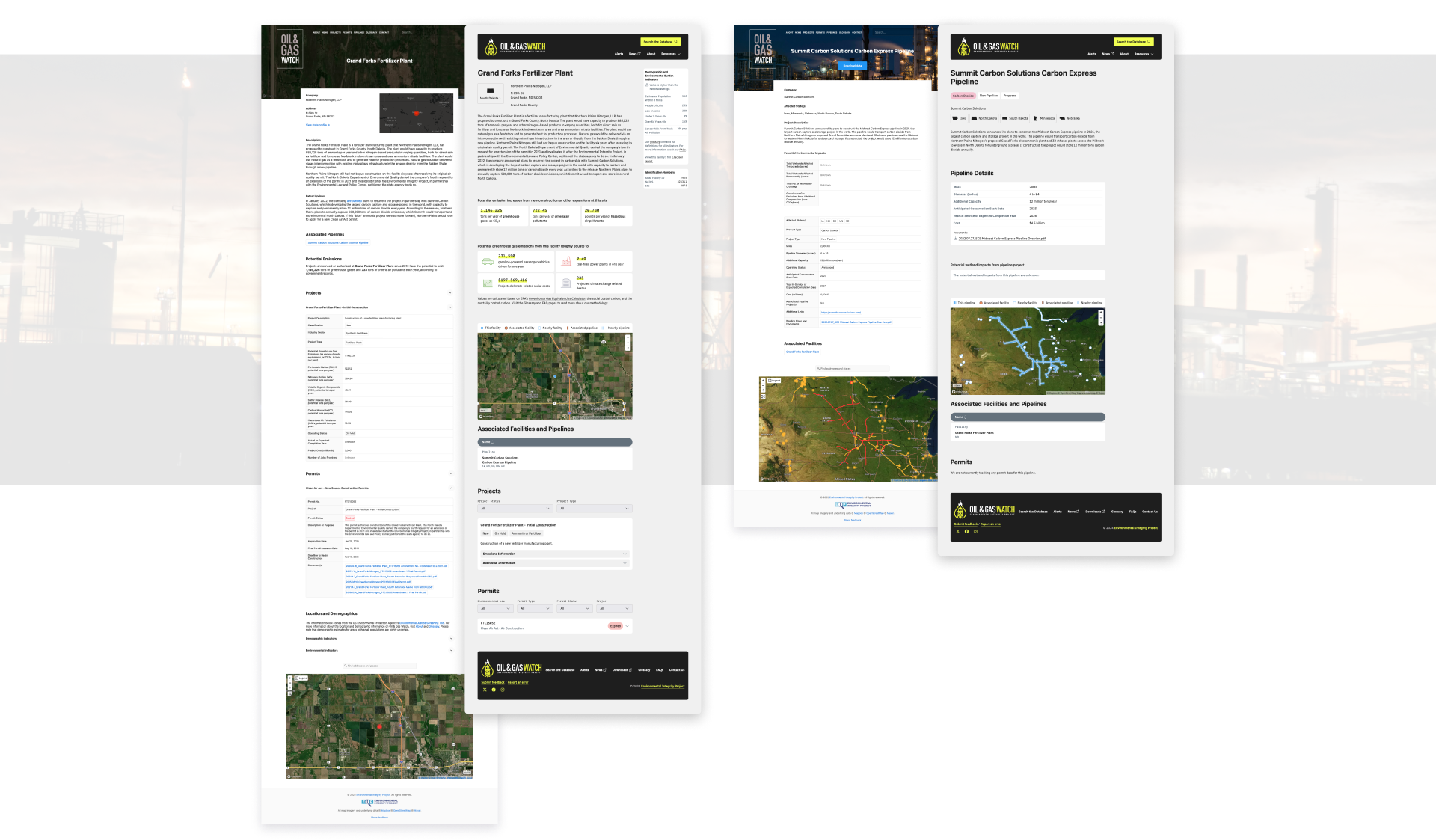
- Reoriented navigation around specific content types, Facilities and Pipelines, giving users a more intuitive journey.
- Removed the unwieldy tables that dominated the site, replacing them with smaller, more digestible chunks reinforced with maps and visual aids.
- Harnessed the power of filters, allowing users to quickly find the specific data they need without being overwhelmed by a firehose of information.
A Vivid, Accessible Design System
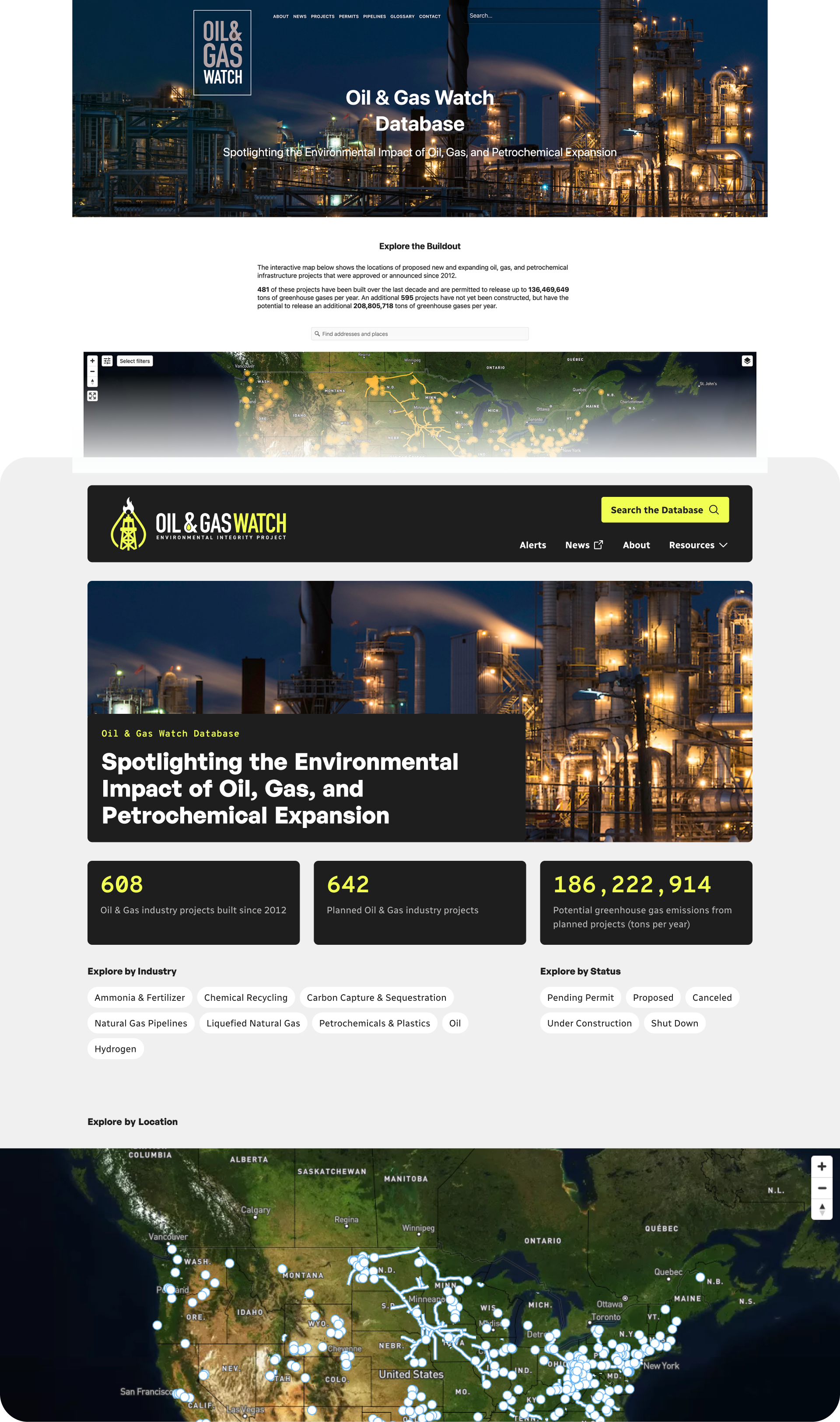
Continuing with the theme of simplification, we saw an opportunity to craft a design toolkit that supported the UX with a minimal, vivid color palette. This gave the site a distinct character that reflected the amount of detail in the data while making key metrics stand out, even when scanning. That character simultaneously supported the goals of the UX strategy and put Oil and Gas Watch in WCAG compliance.
Building a Modern Data Backend
Early on in the Discovery phase, we identified the need for a new data solution with EIP. Their existing data infrastructure frequently caused failed imports and made embeds challenging without providing appropriate documentation to problem-solve. We had chosen Vue.js and Vue Router as our front-end solutions, giving us the power to create a scalable and responsive UI. We needed a data partner to match.
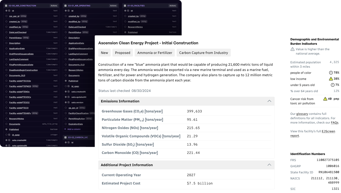
Using an export of EIP’s PostgreSQL database, we starting looking around at different DBaaS (Database-as-a-service) solutions. We wanted something that would give the EIP full control over their own data, in a way that was easy and straightforward for them to make changes as the climate science warranted. After exploring several potentials, we eventually landed on Xata.
Xata is a serverless Postgres solution offering us the flexibility we were looking for with a straightforward “spreadsheet-like” interface for managing records and robust branching options, which then in turn gave us a self-documenting system for writing JavaScript queries. We worked closely with Xata internally, creating a valuable partnership with them and their product, and will continue to use the building blocks we’ve established on more dynamic data visualization projects going forward.
A Tool for Environmental Accountability
Oil and Gas Watch is now a resource that works for the people who depend on it. Policy researchers can dig into facility-level detail, and members of the public can track environmental impact in their own communities. Reliable data infrastructure replaced the failed imports of the old system, content-oriented navigation and filtering replaced unwieldy tables, and a vivid, WCAG-compliant design makes the numbers behind environmental accountability scannable at a glance. What began as a hard-to-navigate dataset is now a tool built to hold industry accountable.



.jpg)